
Brief Introduction to Bitcoin Rainbow Chart
Ever stared at a Bitcoin price chart and wondered, “How do I make sense of all these ups and downs?” You’re not alone. The cryptocurrency market is known for its wild swings, making it tough for both beginners and seasoned traders to spot trends or gauge the right time to act. That’s where the bitcoin rainbow chart steps in—a visually engaging, community-driven tool designed to simplify the process of long-term bitcoin valuation.
What Makes the Bitcoin Rainbow Chart Different?
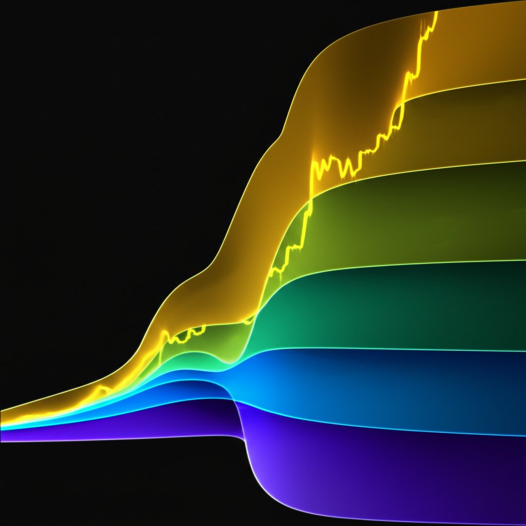
Imagine a chart where Bitcoin’s price journey is mapped not just with lines and numbers, but with a spectrum of colors. Each color band represents a different phase in Bitcoin’s market cycle, making it easy to see whether the asset is considered historically undervalued, fairly valued, or even in bubble territory. Instead of getting lost in technical jargon, you’re met with a straightforward, color-coded guide to where it stands in its long-term trend.
- Blue and Green Bands: Indicate historically lower price phases—potential opportunities for accumulation.
- Yellow and Orange Bands: Suggest more neutral or rising market sentiment.
- Red Bands: Signal historically high price phases—often associated with overvaluation or market exuberance.
Sounds simple? That’s the point. The rainbow chart distills years of price data into a format that’s easy to read at a glance. Whether you’re a long-term investor looking for entry points or an active trader aiming to refine your strategy, this chart helps you quickly assess the market’s mood and potential turning points.
A Community-Driven Origin Story
The bitcoin rainbow chart didn’t come from a big financial institution—it was born out of the crypto community itself. First appearing in 2014, during a challenging bear market, it was posted by a Reddit user to help others make sense of Bitcoin’s long-term potential. The playful use of colors soon caught on, and the chart evolved with input from traders, developers, and enthusiasts alike. Over time, it’s been updated to reflect new data and shifting market realities, maintaining its relevance through multiple Bitcoin cycles.
Why Use the Rainbow Chart?
For investors and traders, the main draw is clarity. Instead of reacting to the daily noise, you can step back and see the bigger picture. The rainbow chart helps you:
- Visualize long-term bitcoin valuation trends
- Gauge market sentiment at a glance
- Spot potential buying or selling zones based on historical patterns
Of course, it’s not a crystal ball. The chart is best used as a reference point—one tool among many for making informed decisions. But if you’re looking to cut through the complexity and gain a clearer perspective on Bitcoin’s journey, the bitcoin rainbow chart is an excellent place to start.
What Is the Bitcoin Rainbow Chart Specifically?
Ever wondered how a simple spectrum of colors can help decode years of complex Bitcoin price history? The rainbow chart bitcoin isn’t just a vibrant graphic—it’s a carefully constructed model designed to make sense of Bitcoin’s long-term price action. But what’s really behind those colorful bands, and how can you use them to inform smarter decisions?
How the Rainbow Bitcoin Chart Is Built?
Let’s break it down. At its core, the rainbow bitcoin chart is a logarithmic regression tool. This means it takes all the wild ups and downs of Bitcoin’s price and plots them on a logarithmic scale, rather than a standard linear one. Why use this approach? Because Bitcoin’s growth, like many assets in early adoption phases, has been exponential—its price jumps by orders of magnitude rather than by steady, linear increments. A logarithmic scale flattens out these big swings, making long-term trends and cycles much easier to spot.
- Logarithmic Regression: Smooths out Bitcoin’s volatility over years, revealing clearer trend lines.
- Color Bands: The chart overlays a series of colored bands—think blue, green, yellow, orange, and red—each representing a different phase of the market cycle.
Each color band isn’t just for show. They’re calculated based on historical price data, with the regression curve divided into segments. For example, the blue and green zones indicate times when Bitcoin has historically been undervalued, while yellow suggests a more neutral position, and orange to red signals potential overvaluation.
Why Logarithmic Regression?
Imagine trying to chart Bitcoin’s price from its early days to today on a regular graph. The massive jumps would make most of the chart unreadable, with early prices squashed and recent prices towering above. Logarithmic regression solves this by compressing the scale, allowing you to see both the early and recent years in context. This approach aligns with Bitcoin’s unique growth pattern—diminishing returns as it matures and its market cap increases.
- Captures exponential growth: Ideal for assets like Bitcoin that have seen dramatic, compounding gains.
- Highlights market cycles: Makes it easier to spot recurring phases of undervaluation and overvaluation.
Model, Not Prediction: Understanding the Chart’s Limits
It’s tempting to see the rainbow chart bitcoin as a predictive tool, but that’s not its true purpose. The chart is a visualization of historical data, not a fortune teller. It’s built on the assumption that Bitcoin’s price will continue to follow its historical growth pattern—but as with any model, external shocks or major changes in adoption can throw things off. The colored bands are best viewed as broad value zones, not precise signals for buying or selling.
- Historical reference: Shows where Bitcoin’s price has tended to fall within each phase of past cycles.
- Not a crystal ball: Unforeseen events, regulatory shifts, or changes in market structure can disrupt these patterns.
How to Look Into the Rainbow Chart Bitcoin for an Initial Understanding?
Getting started is simple. When you view a rainbow bitcoin chart online, you’ll notice Bitcoin’s price plotted against the colored bands. If the price is in the blue or green zones, it’s historically been a time of undervaluation. If it’s in the orange or red zones, caution is warranted, as these have marked previous peaks. To get the most out of the chart, consider how current price action aligns with these historical bands, but always combine this insight with other research and analysis tools.
In short, the rainbow chart bitcoin provides a powerful, at-a-glance overview of where Bitcoin stands in its long-term cycle. By understanding its construction and logic, you can use it to inform your strategy—always remembering that it’s a guide, not a guarantee. Next, let’s break down what each color band specifically means for traders and investors.
Interpreting Bitcoin Rainbow Chart Colors and Market Meaning
Ever looked at the bitcoin rainbow chart bands and wondered, “What does each color really mean for my portfolio?” You’re not alone. The beauty of this chart is its simplicity—yet each color band is packed with historical market sentiment and potential strategy signals. Let’s break down what these colors represent, how to interpret them, and what actions investors have historically considered at each stage.
Breaking Down the Rainbow: What Each Band Means?
Imagine the chart as a spectrum of market mood, from icy caution to blazing exuberance. Here’s how the most common color bands are typically interpreted, based on community consensus and historical trends:
- Dark Blue – “Fire Sale”
- Sentiment: Extreme fear, widespread pessimism.
- Meaning: Bitcoin is seen as highly undervalued compared to its long-term trend.
- Typical Actions: Historically, patient investors have viewed this as a rare buying opportunity—think of it as the market’s clearance rack.
- Blue – “Buy”
- Sentiment: Cautious optimism.
- Meaning: Bitcoin remains undervalued, but the market is starting to recover from its lows.
- Typical Actions: Accumulation phase for long-term believers; many consider adding to their positions here.
- Light Blue – “Accumulate”
- Sentiment: Early optimism, slow return of confidence.
- Meaning: Still below historical averages, but upward momentum is building.
- Typical Actions: Gradual accumulation; investors may dollar-cost average to smooth out volatility.
- Green – “Accumulate” or “Buy”
- Sentiment: Growing confidence, positive outlook.
- Meaning: Market is recovering, Bitcoin is near its fair value based on long-term trends.
- Typical Actions: Many see this as a solid entry point for long-term positions or to add to existing holdings.
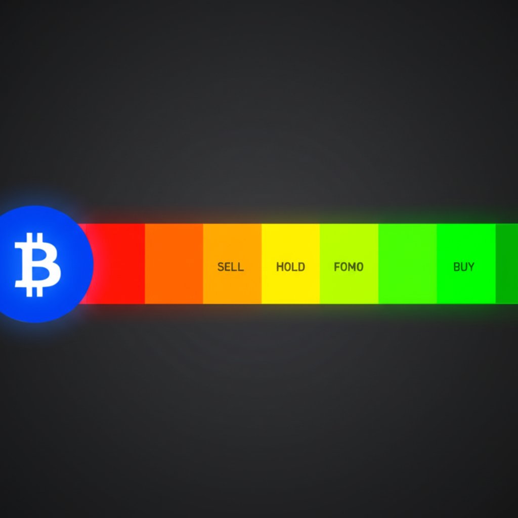
- Yellow – “Hold”
- Sentiment: Neutral, watchful.
- Meaning: Bitcoin is neither undervalued nor overvalued; the market is balanced.
- Typical Actions: Investors typically hold their positions and monitor for signs of the next big move.
- Light Orange – “Cautious Optimism”
- Sentiment: Early excitement, some FOMO (fear of missing out).
- Meaning: Bitcoin is edging above historical averages, signaling growing enthusiasm.
- Typical Actions: Some may start to take partial profits; others ride the momentum upward.
- Orange – “FOMO”
- Sentiment: High excitement, FOMO dominates.
- Meaning: Bitcoin is well above its long-term average, and market hype is strong.
- Typical Actions: More experienced investors may begin scaling out or setting tighter stop-losses; new entrants often rush in.
- Red – “Sell”
- Sentiment: Overconfidence, euphoria.
- Meaning: Bitcoin is considered overbought, with price far above historical norms.
- Typical Actions: Taking profits, reducing exposure, or preparing for a possible correction.
- Dark Red – “Maximum Bubble Territory”
- Sentiment: Extreme greed, market mania.
- Meaning: Bitcoin is viewed as highly overvalued—well into speculative bubble territory.
- Typical Actions: Historically, this is where many major price corrections have started. Prudent investors often exit or hedge their positions here.
How to Use the Bitcoin Rainbow Chart Bands Effectively?
Sounds straightforward? It is—but with a big caveat. The bitcoin rainbow chart meaning is rooted in historical data, not future predictions. Each color band reflects where Bitcoin has traded in past cycles, but there’s no guarantee these patterns will always repeat. That’s why many analysts recommend using the rainbow chart as a broad sentiment gauge, rather than a precise buy/sell indicator.
- When prices are in the cooler bands (blue, green), Bitcoin has historically been undervalued—potentially a good time to accumulate, if your research supports it.
- As prices move into the warmer bands (orange, red), market sentiment grows more exuberant—historically, these have been riskier times to enter large positions.
- Dark red bands have often preceded major corrections, but timing tops is notoriously difficult.
It’s also important to remember that the chart doesn’t account for short-term volatility, regulatory news, or macroeconomic shocks. Use it as a high-level guide to market cycles, and always combine it with other forms of analysis—like moving averages, RSI, or on-chain data.
Key Takeaway: Context Is Everything
So, what’s the real value of understanding these bands? It’s about perspective. The rainbow chart helps you zoom out, cut through the daily noise, and see where Bitcoin’s price stands in the context of its long-term cycle. Whether you’re a cautious accumulator or a seasoned trader, knowing the historical sentiment behind each color can help you make more informed, less emotional decisions.
Next, we’ll explore how the chart itself has evolved over time and why different versions might show slightly different bands or meanings—giving you even deeper insight into this unique crypto tool.
The Evolution and Key Versions of the Rainbow Chart
Ever wondered how a playful, color-coded chart became one of the most recognizable tools in the Bitcoin community? The evolution of the bitcoin rainbow chart is a story of creativity, adaptation, and the power of community-driven innovation. Let’s walk through the major milestones and see how this tool has changed to better reflect Bitcoin’s maturing market.
How It Started: Early Roots and Community Spirit
Imagine the scene in 2014—a bear market in full swing, prices falling, and morale low. That’s when a Reddit user named Azop began posting the first versions of what would become the Bitcoin Rainbow Chart. These early charts used a logarithmic scale to smooth out Bitcoin’s wild price swings and overlaid simple color bands labeled “Sell!”, “Average,” and “Buy!” on top. The chart was less about precise forecasting and more about offering hope and perspective during tough times.
- 2014: Azop’s rainbow chart debuts on Reddit, quickly becoming a morale booster.
- Technical foundation: Logarithmic regression lines make sense of exponential price growth.
- Community-driven: Updates and tweaks were shared in forums, reflecting new data and sentiment shifts.
Refining the Model: From Straight Lines to Realistic Curves
Sounds simple? It was—until the limitations of the early model became clear. The original chart was a straight line on a log scale, implying endless exponential growth. But as Bitcoin matured, it was obvious that this approach was too optimistic. Enter user Trolololo, who contributed a more scientific logarithmic regression formula, smoothing out the curve and creating a more sustainable long-term trajectory.
- 2019: Blockchaincenter.net launches a live version, first using Azop’s straight line, then switching to Trolololo’s curve for greater realism.
- New labels: The bands are renamed to reflect a broader range of market sentiment, from “Fire Sale” to “Maximum Bubble Territory.”
The chart’s popularity exploded in 2020, thanks in part to viral tweets from prominent Bitcoiners. It became a meme, but also a valuable tool for visualizing long-term cycles and sentiment.
Major Turning Point: The Birth of Bitcoin Rainbow Chart v2
But what happens when the model no longer fits reality? In late 2022, Bitcoin’s price dipped below the lower bounds of the original rainbow chart for the first time in nearly a decade. This break sparked debate: Was the model obsolete, or did it need an update?
Rather than abandon the chart, the creator at Blockchaincenter.net introduced bitcoin rainbow chart v2. This new version recalibrated the underlying formula using nine more years of price data, reflecting Bitcoin’s reduced volatility and slower growth as the market matured.
- Key improvements in v2:
- Updated logarithmic regression to better fit recent price action
- Retained the familiar color bands and sentiment-driven labels
- More realistic upper and lower bounds to accommodate Bitcoin’s evolving growth rate
The new version kept the spirit of the original but offered a more accurate reflection of where Bitcoin stood in its cycle. Both the original and v2 remain available for comparison, highlighting the transparent, community-first approach to the chart’s evolution.
What’s Next?
So, where does the rainbow chart go from here? Its journey shows that no model is perfect—but with ongoing updates and a focus on narrative over prediction, it continues to offer valuable perspective. Whether you use the original or v2, the chart’s real power lies in its ability to distill years of Bitcoin history into a single, colorful arc.
Up next, let’s see how these evolving bands and formulas help traders and investors forecast potential price ranges and set long-term expectations.
Forecasting Bitcoin Prices with the Rainbow Chart
Ever wondered if there’s a way to make sense of Bitcoin’s wild price swings without staring at endless technical charts? The bitcoin rainbow chart price prediction approach offers a unique perspective—helping you visualize where Bitcoin stands in its long-term cycle, and what that might mean for future price action. But how reliable is this tool for forecasting, and what should you keep in mind when using it?
How the Rainbow Chart Informs Price Forecasts?
Imagine you’re looking for clues about when to buy, hold, or sell Bitcoin. Instead of relying on gut feeling, the rainbow chart provides a color-coded roadmap based on where Bitcoin’s price sits relative to long-term historical trends. Each band acts as a zone of market sentiment, offering a broad indication of whether Bitcoin is considered undervalued, fairly valued, or in speculative territory.
- Lower Bands (Blues/Greens): Historically, these have been seen as support zones—periods when Bitcoin is undervalued and accumulation is common.
- Middle Bands (Yellows): These represent neutral or fair value, often signaling a time to hold and observe.
- Upper Bands (Oranges/Reds): Traditionally, these act as resistance zones—where overvaluation, FOMO, and market euphoria peak, historically preceding corrections.
In practice, the chart doesn’t pinpoint exact highs or lows. Instead, it frames Bitcoin’s price within these broader market cycles, helping you set realistic long-term expectations. For example, if Bitcoin’s price dips into the blue or green bands, the chart suggests a period of fear or undervaluation—historically times when patient investors have accumulated. Conversely, if the price climbs into the red band, it signals caution, as previous cycles have seen corrections from these levels.
Support and Resistance: The Role of the Bands
Think of each color band as a soft boundary—support when prices are low, resistance when they’re high. Here’s how traders often interpret these zones:
- Support (Blue/Green): If Bitcoin’s price approaches or dips into these bands, it’s historically found a floor, often sparking renewed interest and upward movement.
- Resistance (Orange/Red): When prices approach the upper bands, the chart has often marked the end of euphoric rallies, with corrections or consolidations soon after.
These zones aren’t hard-and-fast rules, but they offer a valuable framework for understanding where Bitcoin sits in its cycle. For example, in past cycles, buying during blue or green phases and trimming exposure in red phases has aligned with favorable long-term outcomes—though, as always, past performance is not a guarantee of future results.
Speculative Nature: Not a Crystal Ball
It’s tempting to treat the rainbow chart as a prediction engine, but it’s best viewed as a broad forecasting tool. The chart’s strength lies in smoothing out short-term volatility, helping you see the forest for the trees. It’s based on historical price action and market psychology—not on future news, regulatory shifts, or black swan events.
- The chart is not designed for day trading or precise entry/exit timing.
- It should be combined with other research—such as on-chain data, macro trends, or technical indicators—for a more complete view.
- Major deviations can occur, especially during periods of extreme volatility or market paradigm shifts.
So, what’s the real value of a bitcoin rainbow chart forecast? It’s about perspective. By highlighting broad zones of market sentiment, the chart can help you avoid emotional decisions, set realistic expectations, and recognize when Bitcoin might be entering historically significant phases—whether for accumulation or caution.
Next, we’ll show you where to find live, up-to-date rainbow charts and what features to look for when tracking Bitcoin’s journey in real time.
Finding Live Bitcoin Rainbow Chart Data
Ever wondered, “Where can I actually see the bitcoin rainbow chart live today?” or “How do I know if the chart I’m viewing is up-to-date and reliable?” Navigating the world of crypto tools can be overwhelming, but finding a trustworthy, interactive, and current rainbow chart doesn’t have to be complicated. Let’s break down exactly where to look and what features matter most when tracking Bitcoin’s journey across the rainbow.
Top Sites for Bitcoin Live Rainbow Chart Access
Imagine you want to check Bitcoin’s long-term trend at a glance—without sifting through dozens of outdated or confusing charts. Here are the most reputable sources for live rainbow chart data, each with its own strengths:
- Blockchaincenter.net
- Widely recognized as the original home of the Bitcoin Rainbow Chart.
- Offers both the classic and updated v2 models, so you can compare historical and current perspectives.
- Interactive chart lets you hover over specific dates and prices, revealing which band Bitcoin is in at any point in time.
- Updated frequently to reflect the latest market moves and community input.
- Rainbowchart.com
- Features a live, easy-to-read version of the rainbow chart, built directly on the original model discussed in crypto forums.
- Simple interface and clear labeling make it ideal for quick checks or beginners.
- Shows real-time price overlays, so you always know where Bitcoin stands within the colored bands.
Both sites clearly state that the chart is not investment advice, but rather a visualization tool for understanding long-term trends. Always remember to do your own research and consider the rainbow chart as just one piece of your analysis toolkit.
What to Look for in a Live Rainbow Chart?
When choosing where to view a bitcoin live rainbow chart, keep an eye out for these essential features:
- Interactivity: The best charts let you zoom, hover, and explore historical data, not just view a static image.
- Updated Data: Reliable charts reflect the most current price action—no one wants to make decisions based on last month’s numbers.
- Clarity and Labeling: Look for clear color bands, well-defined labels, and easy-to-read axes. This ensures you can quickly interpret the data, even if you’re new to the concept.
- Version Transparency: Some sites offer both the original and updated (v2) models. Being able to compare these can help you understand how the chart has adapted to changing market conditions.
Sounds straightforward? It is—but only if you stick to reputable sources. Relying on unverified charts or outdated screenshots can lead to confusion or misinformed decisions. That’s why sites like Blockchaincenter and Rainbowchart.com are trusted by the community—they prioritize accuracy, transparency, and user experience.
Why Reliable Data Matters for Ongoing Analysis?
Imagine making a long-term investment decision based on an outdated or miscalculated chart. Not ideal, right? In the fast-moving world of crypto, using live, accurate, and well-maintained tools is crucial for staying ahead and avoiding costly mistakes. By choosing reliable sources for your rainbow chart data, you equip yourself to spot trends, gauge sentiment, and make more informed decisions—whether you’re a casual observer or a serious investor.
And for those actively participating in fast-paced ecosystems like Solana—especially during altcoin season when volatility is high—tools like TradeWiz’s trading bot can complement your analysis. With lightning-fast execution and powerful copy trading features, TradeWiz helps users capitalize on rapidly shifting opportunities. It’s particularly useful when rainbow charts and indicators signal macro trends, but you still need to act on micro-movements with speed and precision.
Now that you know where and how to access the rainbow chart in real time, let’s explore some of the different models and variations that have emerged—helping you choose the one that best fits your analytical style and needs.

Exploring Different Rainbow Chart Models Like Blum Code
Ever found yourself wondering, “Why do some rainbow charts look different from others?” or “What’s the real difference between the classic chart and newer versions like the bitcoin rainbow chart blum code or the bitcoin power law rainbow chart?” If so, you’re not alone. As the rainbow chart concept has evolved, several distinct models have emerged—each with its own approach to mapping Bitcoin’s long-term price cycles. Let’s break down the key differences so you can choose the version that fits your analytical style.
Why Multiple Models?
Imagine you’re trying to forecast the weather. One model might use historical averages, another might factor in climate cycles, and a third could rely on cutting-edge algorithms. The rainbow chart world is similar: as Bitcoin’s market matures and more data becomes available, analysts and developers have experimented with different mathematical models to better capture the asset’s unique price behavior.
Here are the three most common rainbow chart models you’ll encounter:
- Classic Logarithmic Regression (Original Rainbow Chart)
- Blum Code Variation
- Power Law Model
Model Methodologies—A Quick Overview
- Classic Logarithmic Regression: This is the foundation of most rainbow charts, including the widely referenced version on Blockchaincenter.net. It uses a logarithmic regression formula to fit Bitcoin’s price data, smoothing out exponential growth into a readable curve. The color bands are then layered on top, dividing the curve into sentiment-driven zones—from undervalued to bubble territory. This model is simple, transparent, and has a strong track record for mapping long-term cycles.
- Blum Code Variation: The “blum code” refers to a specific approach to band calculation and labeling, sometimes using alternative regression formulas or statistical techniques to adjust for recent price deviations. This model often recalibrates more frequently, aiming to reflect Bitcoin’s evolving volatility and market structure. The result is a chart that may show slightly different band placements or widths, potentially offering a more responsive snapshot of current trends.
- Power Law Model: Some analysts argue that Bitcoin’s long-term growth follows a power law relationship rather than a strict logarithmic one. The power law model plots price against time using a different mathematical formula, often resulting in bands that widen or narrow at different rates compared to the classic chart. This approach tries to capture the diminishing returns and volatility compression as Bitcoin matures.
Side-by-Side Comparison: Key Features of Each Rainbow Chart Model
| Model | Formula Basis | Band Calculation | Best For | Key Strength | Potential Limitation |
|---|---|---|---|---|---|
| Classic Logarithmic Regression | Logarithmic regression (y = a*ln(x) + b) | Fixed bands based on historical price data and regression curve | Long-term trend visualization, cycle analysis | Simple, widely recognized, easy to interpret | May lag behind rapid market changes |
| Blum Code Variation | Custom regression or dynamic statistical methods | Bands recalibrated to recent volatility or price action | Adapting to new market realities | More responsive to recent data | Less historical consistency, can change frequently |
| Power Law Model | Power law (y = a*x^b) | Bands expand/contract based on power law scaling | Modeling diminishing returns, maturing assets | May better fit late-stage growth patterns | Less intuitive for newcomers, fewer public versions |
How to Choose the Right Model for You?
Sounds complex? It doesn’t have to be. Here’s a quick guide to help you decide:
- If you want the most established and widely used tool: Stick with the classic logarithmic regression rainbow chart. It’s easy to find, simple to understand, and backed by years of community use.
- If you’re looking for a chart that adapts quickly to market changes: The blum code variation may be worth exploring, especially if you follow analysts who frequently update their models.
- If you’re focused on the mathematics of diminishing returns: The power law model could offer deeper insights, especially for those interested in Bitcoin’s long-term maturation and volatility trends.
Ultimately, each version of the rainbow chart aims to provide a clearer, more actionable view of Bitcoin’s journey—but the best model is the one that matches your analytical needs and risk tolerance. As these models continue to develop, they offer new ways to visualize cycles, spot turning points, and refine your strategy. Up next, let’s see how the rainbow chart can be used as part of a broader technical analysis toolkit to inform smarter trading decisions.
Using the Rainbow Chart as a Technical Indicator
Ever wondered how a single chart could help you see the bigger picture while keeping you grounded during market chaos? That’s the magic of the bitcoin rainbow price chart indicator. Instead of getting lost in short-term volatility, you can use this tool to anchor your strategy and spot major turning points in Bitcoin’s long-term cycle. But how do you actually integrate it with other technical tools—and what does it mean for traders using advanced platforms or bots?
Why Use the Rainbow Chart in Your Technical Toolkit?
Imagine you’re building a house. You wouldn’t rely on just one tool—you’d use a full set, each with a specific purpose. The bitcoin rainbow price chart is like the blueprint: it gives you a high-level view of where you are in the market cycle. Here’s how it fits into a broader trading approach:
- Macro Sentiment Gauge: The rainbow chart’s color bands instantly show you whether Bitcoin is historically undervalued (cooler bands) or overheated (warmer bands), helping to avoid emotional decisions during hype or panic phases.
- Cycle Turning Points: By observing when Bitcoin enters or exits key bands—like moving from green (accumulate) to orange/red (FOMO/sell)—you can identify potential inflection points that have marked major shifts in previous cycles.
- Bias Confirmation: Already have a bullish or bearish outlook? The rainbow chart helps confirm (or challenge) your bias by showing where the current price sits in the long-term context, making it easier to avoid tunnel vision.
Combining the Rainbow Chart with Other Indicators
Sounds useful, right? But it gets even better when paired with classic technical indicators. Here’s how you can create a more robust analysis:
- Relative Strength Index (RSI): Use the RSI to spot overbought or oversold conditions. If Bitcoin is in a blue band (undervalued) and RSI is also low, that’s a strong convergence for potential accumulation. If both are in overheated zones, caution is warranted.
- Moving Averages: Overlay simple or exponential moving averages to confirm trend direction. For example, if Bitcoin is moving from green to yellow on the rainbow chart and also crossing above its 200-day moving average, it could signal a long-term bullish shift.
- On-Chain Metrics: Combine the rainbow chart with network activity or transaction volume for an even deeper perspective on market health and potential reversals.
By layering these tools, you gain a more holistic view—reducing the risk of acting on isolated signals or short-term noise.
For Automated Traders and TradeWiz Users
When you’re running automated strategies or using platforms like TradeWiz, the rainbow chart’s long-term perspective becomes even more valuable. Here are reasons:
- Strategy Alignment: Imagine your trading bot is set to copy top-performing traders on Solana. If the rainbow chart signals a broad Bitcoin accumulation phase, you might adjust your bot’s risk settings—favoring more aggressive entries in altcoins when macro sentiment is bullish.
- Macro-Informed Automation: The rainbow chart can serve as a filter for when to activate or pause certain automated strategies. For instance, you could instruct your bot to reduce exposure when Bitcoin enters the red or dark red bands, historically associated with market tops.
- Quick Reaction to Macro Shifts: TradeWiz’s ultra-fast execution (under 2–4 seconds) means you can act on macro shifts identified by the rainbow chart almost instantly—whether that’s scaling into new opportunities or tightening risk management during overheated periods.
In short, the rainbow chart isn’t just for manual, long-term investors. It empowers both discretionary traders and those leveraging automation to align their strategies with the broader market cycle, making every move more informed and less reactive.
Key Point: Context Is Your Competitive Edge
When you integrate the bitcoin rainbow price chart indicator with your technical analysis toolkit, you’re not just chasing short-term moves—you’re building a strategy grounded in macro context. Whether you’re confirming your bias, identifying cycle turning points, or syncing automated bots to major market shifts, the rainbow chart helps you trade smarter and stay ahead of the curve. Next, let’s see how this macro perspective could shape your approach as we look ahead to Bitcoin’s outlook in 2025.

The Rainbow Chart’s Significance for Bitcoin in 2025
Wondering what the bitcoin rainbow chart 2025 could reveal about Bitcoin’s next big move? As we look ahead, many investors and traders are asking how this colorful tool might help decode the post-halving landscape and what scenarios could play out across its bands. Let’s break down what the chart suggests for 2025, how halving events shape its interpretation, and how long-term holders might position themselves based on these insights.
How Halving Events Influence the Rainbow Chart?
First, why do Bitcoin halvings matter so much? Every four years, the reward for mining new Bitcoin blocks is cut in half, reducing the rate at which new coins enter circulation. This event is widely viewed as a catalyst for supply shocks, often sparking bullish momentum in the months and years that follow. Historically, after each halving, Bitcoin’s price has moved from the lower bands of the rainbow chart toward the upper ones—reflecting cycles of accumulation, optimism, and eventual exuberance.
- After the 2012, 2016, and 2020 halvings, Bitcoin’s price spent time in blue and green bands before trending upward.
- In the years following, the price often climbed through yellow and orange bands, sometimes reaching red or dark red during peak bull markets.
With the most recent halving now behind us, many are watching closely to see if this pattern repeats in 2025.
Bitcoin Rainbow Chart 2025: Possible Price Scenarios
So, where could Bitcoin’s price sit on the bitcoin halving rainbow chart in 2025? While the chart is not a prediction tool, it does offer a framework for mapping potential outcomes based on historical cycles and current sentiment. According to recent data, the rainbow chart bands for June 2025 span a wide range—from roughly $32,787 to $372,813, with each band representing a different market mood:
- Below $43,000: “Basically a Fire Sale” (deep undervaluation)
- $43,000 – $58,000: “BUY!” (accumulation zone)
- $58,000 – $75,000: “Accumulate” (cautious optimism)
- $75,000 – $97,800: “Still cheap” (reasonable value for long-term holders)
- $97,800 – $128,600: “HODL!” (hold steady, resist selling)
- $128,600 – $164,400: “Is this a bubble?” (potential overextension)
- $164,400 – $211,400: “FOMO” (fear of missing out takes over)
- $211,400 – $276,300: “Sell. Seriously, SELL!” (caution zone)
- $276,300 – $372,800: “Maximum Bubble Territory” (extreme overvaluation)
As of the latest available data, Bitcoin is hovering in the “HODL!” band, suggesting a balanced sentiment where long-term holders might choose to stay the course rather than rush to buy or sell. If the price pushes higher into the “Is this a bubble?” or “FOMO” bands, it could signal growing market exuberance—historically, a time for increased caution. Conversely, a move back toward the accumulation zones may offer opportunities for those seeking long-term entry points.
Strategic Takeaways for Long-Term Holders
What does all this mean for your strategy? Here’s how you might use the rainbow chart as a guide—not a guarantee—for 2025 positioning:
- In lower bands (blue/green): Historically, these have been the best times for accumulation, especially following major corrections or after a halving event.
- In middle bands (yellow/HODL): Holding and monitoring the broader cycle has often paid off, as the market decides its next direction.
- In upper bands (orange/red): These zones have historically preceded corrections, so some investors opt to reduce exposure or tighten risk management here.
Remember, the rainbow chart is a visualization of past cycles and sentiment—not a crystal ball. Macroeconomic shifts, regulatory changes, or unexpected news can all disrupt historical patterns. Still, by mapping where Bitcoin sits within the bands, you gain a valuable perspective on potential risk and reward as 2025 unfolds.
Curious how to put this perspective into action? In the next section, we’ll summarize the rainbow chart’s key benefits and limitations—and explore how combining macro analysis with agile tools can help you seize opportunities in any market environment.
Conclusion
When you first encounter the bitcoin rainbow chart, it might seem almost too simple—a splash of color over a price graph. But dig deeper, and you’ll discover a tool that’s helped countless traders and investors navigate Bitcoin’s famously unpredictable market cycles. So, how can you make the most of it, and what should you watch out for as you build your bitcoin rainbow chart trading strategy?
Key Benefits of the Bitcoin Rainbow Chart
- Clarity in Complexity: The chart distills years of price action into an easy-to-read, color-coded format. Instead of getting lost in daily volatility, you get a clear view of where Bitcoin stands in its long-term cycle.
- Sentiment Snapshot: Each band reflects a different mood—from panic selling to euphoric buying—helping you quickly gauge whether the market is fearful, neutral, or greedy.
- Strategy Foundation: By identifying broad zones of undervaluation (blue/green) and overvaluation (orange/red), the chart offers a framework for building disciplined trading strategies—whether you’re accumulating, holding, or reducing exposure.
- Accessible for All: Even if you’re new to crypto, the rainbow chart’s visual nature makes it easy to understand and use without needing advanced technical skills.
Limitations to Keep in Mind
- Not for Short-Term Trading: The chart smooths out daily price swings, so it’s not designed for quick trades or timing intraday moves.
- Historical, Not Predictive: Its bands are based on past cycles—not future guarantees. External shocks, regulatory changes, or macroeconomic surprises can cause the price to break from historical patterns.
- Requires Confirmation: Relying solely on the rainbow chart can lead to overconfidence. Always pair it with other technical indicators, on-chain data, or news analysis to validate your decisions.
- Model Updates Needed: As the market evolves, the chart’s underlying regression must be recalibrated. Using outdated versions could give a misleading picture of current sentiment.
“The Rainbow Chart is best used as part of a broader strategy. Use it to gain perspective, but always do your own research… It indicates ‘this zone has historically meant X,’ but the market can defy expectations at times.”
Bridging Macro Analysis with Fast Execution: The Role of TradeWiz
Imagine spotting a major shift—Bitcoin drops into a blue “accumulation” band, signaling a potential opportunity not just for BTC, but for the broader crypto market. What’s next? This is where combining macro tools like the rainbow chart with agile trading platforms makes all the difference.
- Macro-Informed Action: Use the rainbow chart to identify favorable long-term conditions. If sentiment turns bullish, it might be time to explore new opportunities in altcoins or fast-moving ecosystems like Solana.
- Seamless Execution with TradeWiz: Platforms like TradeWiz empower you to act on these macro signals instantly. With ultra-fast execution and copy trading features, you can quickly follow top strategies or automate your own—bridging the gap between long-term analysis and real-time market moves.
- Strategy Integration: For example, if your macro thesis is bullish based on the rainbow chart, you might instruct your TradeWiz bot to increase risk or allocate more to trending Solana tokens, capitalizing on the broader bullish environment while managing risk with customizable parameters.
Final Takeaway: Combine, Don’t Isolate
The real power of the bitcoin rainbow chart lies in its ability to provide perspective—not predictions. Use it as a compass to navigate market cycles, set expectations, and avoid emotional reactions. But don’t stop there. Pair it with technical indicators, on-chain data, and agile tools like TradeWiz to build a holistic, responsive bitcoin rainbow chart strategy that adapts to both macro trends and fast-moving opportunities. In a market where timing and context are everything, this combination can be your edge for smarter, more confident trading.
Bitcoin Rainbow Chart: Frequently Asked Questions
1. Does the Bitcoin rainbow chart actually work?
The Bitcoin rainbow chart is a visual tool that highlights historical price trends and market sentiment using colored bands. While it helps users spot broad valuation zones and understand long-term cycles, it is not a predictive indicator. It should be used alongside other research and technical analysis for a well-rounded trading strategy.
2. How do I use the Bitcoin rainbow chart for trading?
You can use the rainbow chart to identify periods of historical undervaluation or overvaluation by observing which color band Bitcoin’s price occupies. Many traders combine this with other indicators, such as RSI or moving averages, to confirm market sentiment and inform their entry or exit points. For fast execution or automated strategies, tools like TradeWiz can help capitalize on opportunities when macro signals align.
3. Where can I find live Bitcoin rainbow chart data?
Reliable, up-to-date Bitcoin rainbow charts are available on sites like Blockchaincenter.net and Rainbowchart.com. These platforms offer interactive charts with clear band labeling and frequent updates, ensuring you always have accurate market context for your analysis.
4. What is the difference between the classic rainbow chart, Blum code, and power law models?
The classic rainbow chart uses a logarithmic regression to visualize Bitcoin’s long-term price trends. The Blum code variation recalibrates bands more frequently to reflect recent volatility, while the power law model uses a different mathematical approach to account for diminishing returns as Bitcoin matures. Each model offers a unique perspective for analyzing cycles.
5. Can the Bitcoin rainbow chart help predict Bitcoin’s price in 2025?
The rainbow chart is not a price prediction tool, but it can help you visualize potential market scenarios based on historical cycles—especially after major events like halvings. By seeing which band Bitcoin occupies, you can gauge long-term sentiment and plan strategies, but always combine it with other analysis and stay aware of market changes.

Why use 10 AI tools when https://dufr.digital does it all, even your own bitcoin payment processor?